

One brand, three services: rebranding Chris Barnard Health and building its new website
Chris Barnard Health has spent 15 years building the largest aged care workforce database in Victoria, supplying nursing staff, home care, and NDIS support across the state. That growth had outpaced the brand. We were briefed to build a new identity and website that unified three separate service lines into one clear, human brand, and gave an already stretched and anxious audience an easy reason to trust the business enough to reach out.
The challenge
Chris Barnard Health runs three businesses under one roof: a nursing agency supplying aged care facilities, a home care service helping people stay independent, and an NDIS provider. Each had grown in its own direction, and the brand hadn’t yet caught up to bring them together under one clear story. Families searching for aged care support, often overwhelmed and short on time, needed a faster, clearer route to understanding why Chris Barnard Health was the right choice.
The opportunity was cohesion. Three services, three different tones, and no unified answer to the question every visitor was really asking, which was “why you?” The brief called for one brand strong enough to carry all three, in a market where families are often wary after being let down by providers who promise more than they deliver.
The approach
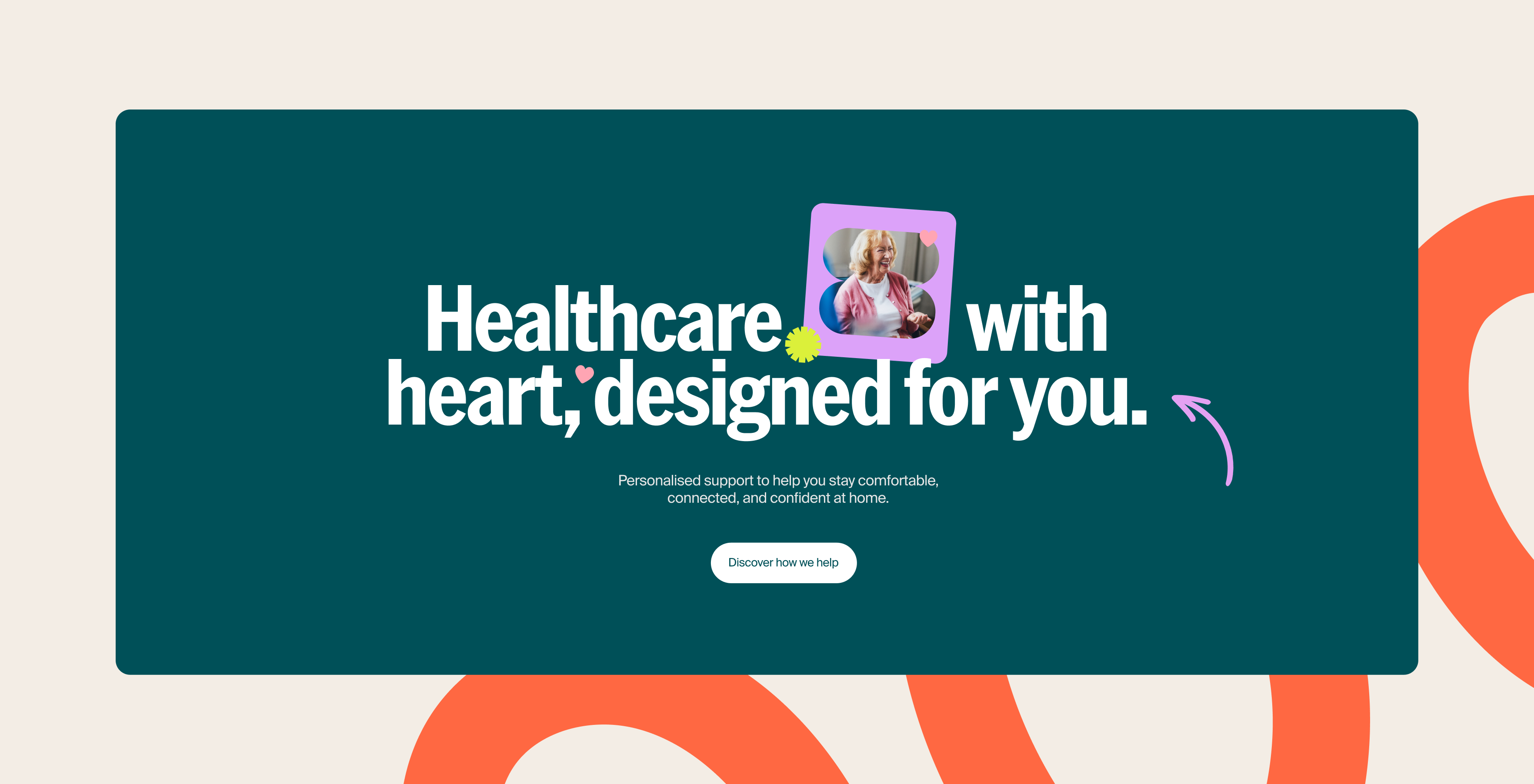
We started with the people. Chris Barnard Health’s own team describe their culture as “big enough to care, small enough to deliver,” and that line became the anchor for everything that followed. The new identity leans warm rather than clinical: a palette running from forest green through coral ember and lime zest, paired with a condensed display headline face and a clean, human body type.
Photography does the heavy lifting. Real people in real moments replace the stock imagery that makes most aged care sites forgettable. The tone of voice sits somewhere between carer and confidant: warm, occasionally playful, and never corporate, built to reassure a family making one of the harder decisions in their life.
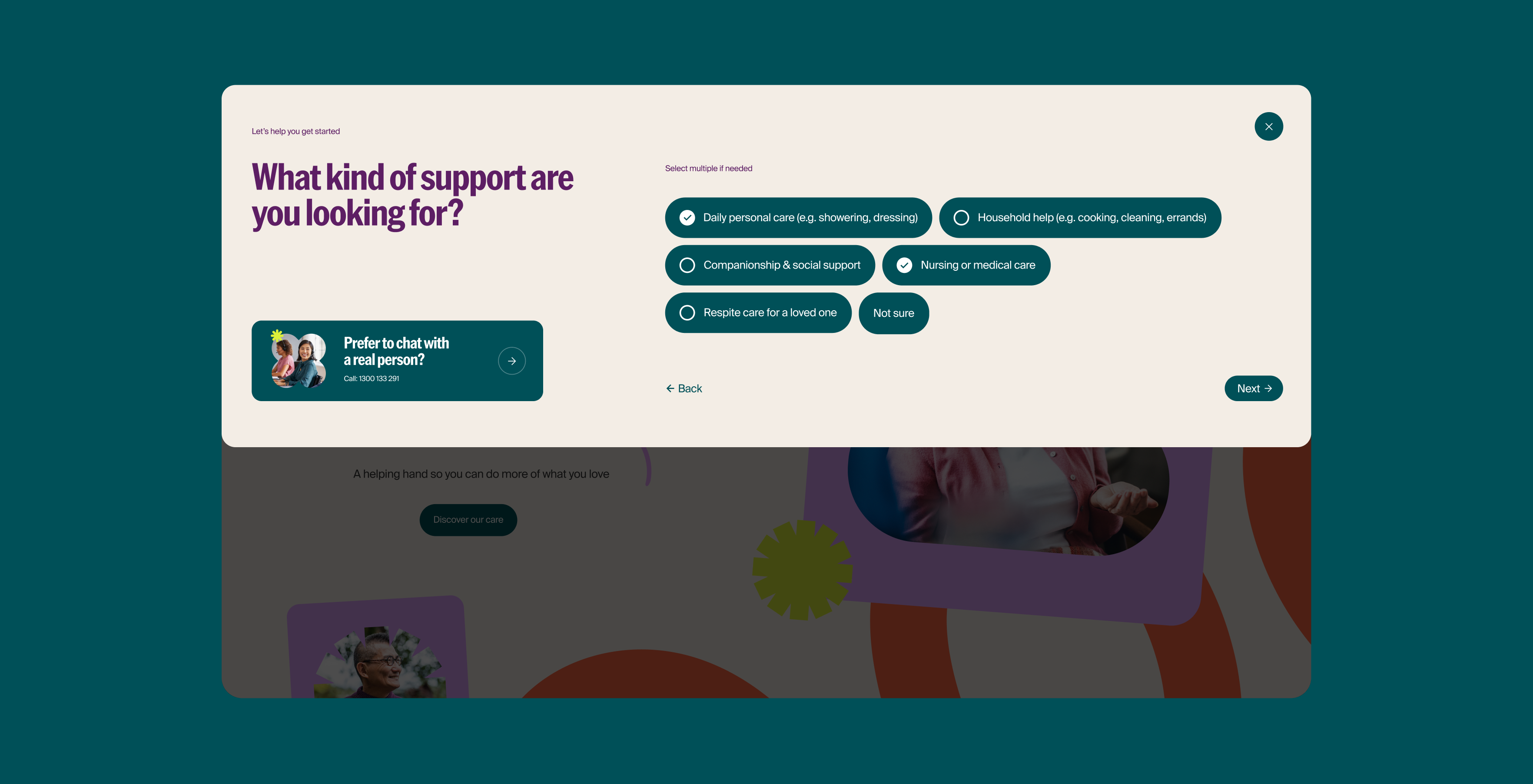
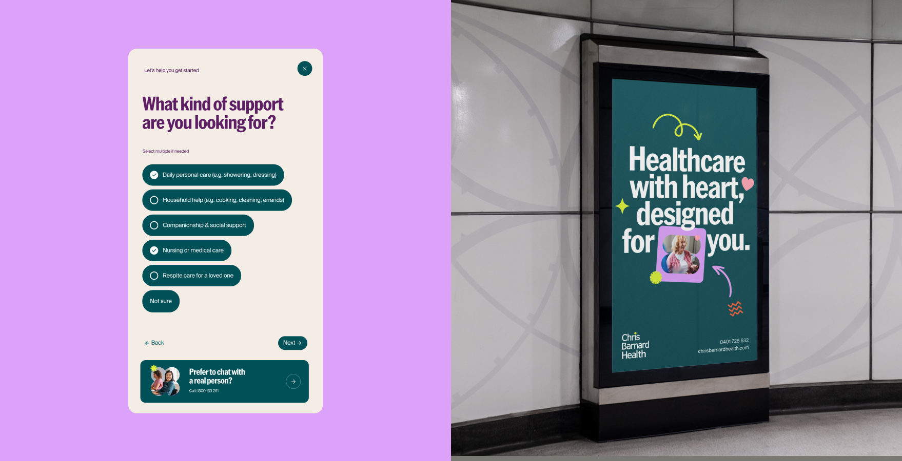
On the website, we simplified the path to enquiry: a clear three-step process, short forms families can fill out without hesitation, and messaging built around outcomes rather than service lists. Fifteen years of experience and a database of 80,000 contacts get shown as proof, not stated as a boast.
The outcome
The result is a site built to convert, not just to look considered. Clear calls to action, “How can we help” and “Let’s talk” among them, sit alongside warm, specific proof points, including 791,000 hours of care delivered, so visitors get both the feeling and the evidence they came for.
More importantly, Chris Barnard Health now has one brand doing the work of three. Nursing agency, home care, and NDIS support all read as part of the same story, told in the same warm, confident voice. It is a foundation built for the national growth the business has planned, and a brand that matches the 15 years of care behind it.
Projects
ANZSOG
INTVL
Coopers

Haven Constructions
Driscoll's Berries