NGK: A UX Case Study
NGK, a valued client of JTB Studios, required a new website design for one of their sub brands. Before we started designing initial concepts, we had the opportunity to conduct user experience research and test the usability of their current site. This research would assist us with the direction we would move forward with when re-designing their new website.
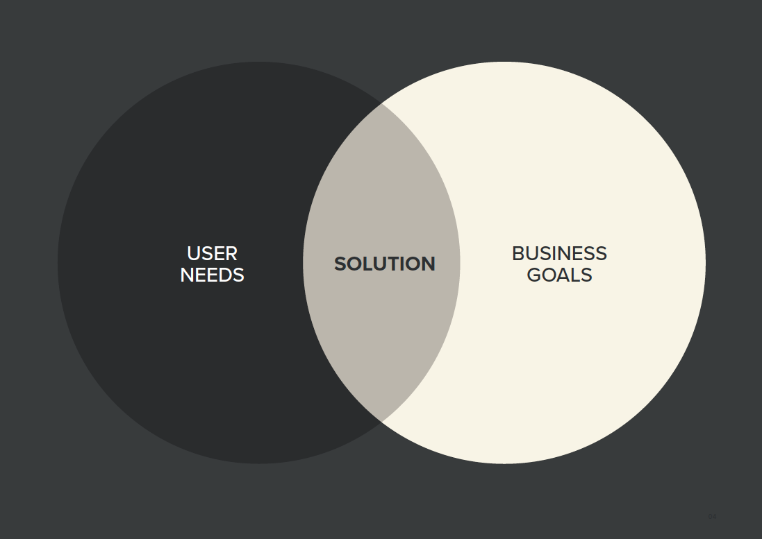
But first, what is user experience design you ask? Jesse James Garret describes it as “the design of anything independent of medium or across media with human experience as an explicit outcome and human engagement as an explicit goal.” User experience is when a user is touching, seeing, hearing, feeling and using apps, websites, devices and products and user experience design is when we make these experiences for users feel effortless and easy to use therefore satisfying the user’s goals and achieve the business goals.
In this article we won’t detail standard process involved when conducting UX research, it’s about the type of research technique’s we chose to pursue and why it was appropriate to this project. We started our research by establishing our clients business goals. Once we understood the types of insights the client wanted out of the research, we were able to determine the research task and the goals we wanted to achieved before starting.
We conducted user interviews as it was the best way to listen to what people say and understand their goals and attitudes as well as usability testing to understand the user’s behaviour. These two methods are both types of qualitative data which, once distilled, will influence the way in which we design for our users.
Before going into the interview process we created conversation topics to discuss. These were directly related to the goals we had set out previously and focused on user demographics, motivations, their individual technology literacy, environmental influences and the frequency in which they used the current website.
Once we conducted each interview we synthesised our research finding by creating affinity maps to establish any patterns between each participant so that we can create user personas based on this data so we can understand and emphasis with the user we are designing for. At this point we were able to established the users goals because we can understand what the users value, and then determine whether the solution we are proposing is the right one to solve their problem.
USABILITY TESTING
Before conducting the usability tests, we established individual task/scenarios which were tailored to the user we were testing. Each scenario related to a similar experience the user would face regularly within their environment. This would give us the best insight into their thought pattern and behaviours. We encouraged them to voice their decisions out loud to eliminate any assumptions being made on our end. We created a detailed user journey map for our client outlining the results using emotive symbols and quotes from the user. We felt it was a great way to visualise the results for the client so they could easily identify each users behaviour and thoughts.
What we found:
- Users were viewing the contented in landscape mode on mobile. By doing so, they were missing critical information as it was cut off.
- One of the designs we tested were perceived as being a faster experience to the other one.
- Images were key to validating the accuracy of their search results.
- The top level of navigation was used to explore the site. At no point did a user explore the homepage.
These insights were critical to the new website design as they share the same target audience as the website we tested on. When Facebook was expanding their ‘like’ feature on their social media site last year, they spent a year of testing the reactions feature. After months of trialling different face styles for these new glyphs they designed, their test results also came back with a few issues. They described these reactions as ‘educational — as they teach us what works, but often more importantly, what doesn’t. They reveal gaps, unknowns, and more.’
Some of their insights were:
- The line-art styling of the illustrations looked great at larger scale, but proved difficult to parse at small sizes — something we’d need when thinking about how people consume these on News Feed;
- Despite the large size of the scrubbable area, people would often slide their finger on top of the labels;
- Some people would invoke the scrubber, then lift their finger so they could tap on a reaction, and this would dismiss the input interface;
- Larger numbers of reactions might open up too much redundancy in the set.
These results helped shape the overall user experience and design of their product just as it did with our proposed solution. We felt our approach allowed for a broad range of feedback, both positive and negative. We always base our design decisions on assumptions, but thanks to UX research, we were able to identify some of the problems the users faced and from those results we are able to revisit the design and tweak it to create a more seamless experience overall.
Stephen G
UI/UX Designer
Blog
Projects
Benchmarque V2
Aquila

ELLA
Westbourne
NGK