Australia's largest educator of writing literacy, empowering teachers to create a classroom full of ideas, laughter & energy.
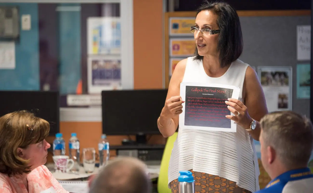
The largest training provider of professional development and teaching resources for writing literacy in Australia, over the last 15 years Seven Steps have trained over 50,000 teachers, who would have taught at least 1.4 million students in their literacy programs.
Programs are delivered through their unique Seven Steps methodology, which empowers teachers to guide their students to become powerful and skilful communicators.

Background
Their brand positioning didn’t align with the market perception as customers are often undervaluing the quality of their product.
Furthermore, as they had grown rapidly since creating their original platform, the architecture of the site had not been designed to effectively scale alongside the business, with new features often bolted on top of the existing setup.
The quality of their original LMS had been compromised by the lack of iterations and improvements to the brand over the years, providing a substandard exer experience to their customers. And this strain was also felt internally with a database that was cumbersome and counter-intuitive to use.
Solution
Present Seven Steps as the leading premium service provider of nationally recognised student literacy programs. At the same time create a scalable & accessible product that allows for future growth, expands the marketing opportunities and offers current and new users an elevated experience with its products.
Branding
The new identity for Seven Steps needed to establish brand authority within the education sector. The new brandmark provides a simplified, more elegant design that presents Seven Steps as a premium education provider while providing personality with a hint of playfulness.
The personality is further explored through typography, colour and additional brand elements. The typography pairs the new primary font Object Sans with Poppins, these two San Serif typefaces compliment each other well and are quirky yet sophisticated.
The original brand offered a robust colour palette and the refresh maintains this while adjusting each hue to be more vibrant, offering great accessibility and stronger contrast when used in tandon.
Brand Meaning
The new brandmark is clean, forward-thinking, modern, reliable, trusted and confident with a hand-drawn line mark underneath the word steps. Further highlighting and literally creating a step. This line is hand-drawn to represent the writing/teaching component of the brand.
Website
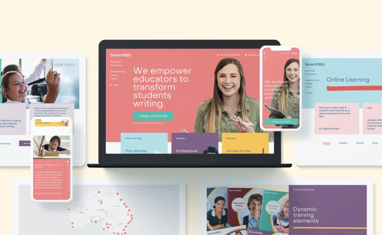
Seven Steps website needed to achieve two goals. Firstly it needed to effectively communicate both who they are and what they do, as an educator they would often receive enquiries from parents but they have the unique positioning as an educator that provides knowledge and learning tools to schools and teachers.
The second goal was to streamline the sales process. Seven Steps offer three very different products, with learning software, workshops and printed toolkits, these products needed to be easily identifiable and clearly separated. While at the same time, the point of sale needed to offer a consistent experience while catering towards individual users, schools or the request for a quote.
The culmination of these goals resulted in a showcase for Seven Steps as a complete product, demonstrating its authority and impact on the education sector. The website engages users in the short and long term strategically through its messaging and refined information architecture.
Playfully Professional
Best UX &UI practices were implemented when designing the main website. With such a vibrant brand and wealth of content, colour combinations and limitations were introduced, each core page would be assigned one primary colour, with a secondary colour used to differentiate. This allows for scenarios where all workshop related pages can be identified through the primary purple colour, but sub-products within workshops feature their own complimentary hue.
Teachers Hub
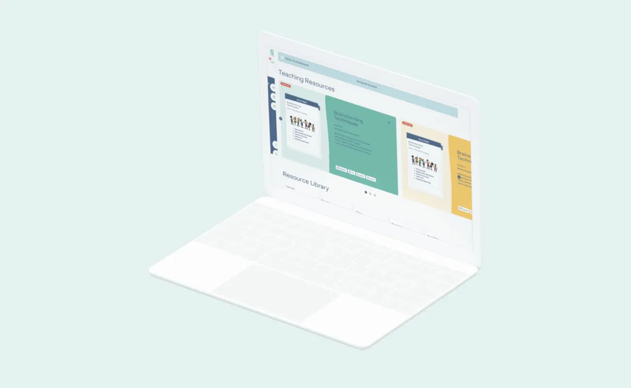
A core part of the Seven Steps experience is the Teachers Hub LMS. The learning platform needed to be an intuitive and engaging tool, that provided an environment that not only supports schools and teachers but incentivises them to return and continually engage with the online delivery service.
The result saw a learning platform that offered lessons, alternate resources and a classroom planner tool. In addition to this, the platform provided room for growth, as the system features sections dedicated to workshops and toolkits, reflecting the main website. This would grant users access to information and resources for other products besides online learning.
Resources
Seven Steps provides an extensive range of learning resources that cater for everything from activities to marking guides. The resources are quite flexible, apart from their broad use, they appear in a variety of locations across the LMS, they can be viewed, added to a planner or downloaded by the user.
Projects
Monash University
Benchmarque 2018

