Partnering with a leading healthcare education provider to implement a brand refresh and enhance their customer sign-up experience.
Benchmarque is an accredited healthcare training and education provider. They offer a mix of online and in-person courses exclusively for healthcare professionals. Benchmarque has been a long-time client of JTB and approached us to improve the user journey to ultimately increase sign-ups and at the same time implement a design refresh of the website to coincide with the launch of their new branding.
The Project
Benchmarque Group were launching a new brand and needed a visual update of their website to accompany it. At the same time there were some noticable usability problems and a desire to increase the conversion of the website. As we dug deeper we were able to uncover the specific issues users were having on the site.
Design challenges
We didn’t have a clear understanding of the customer journey or the audience. Plus we were trying to do two seperate tasks at the same time—a brand piece an a customer journey piece.
The approach
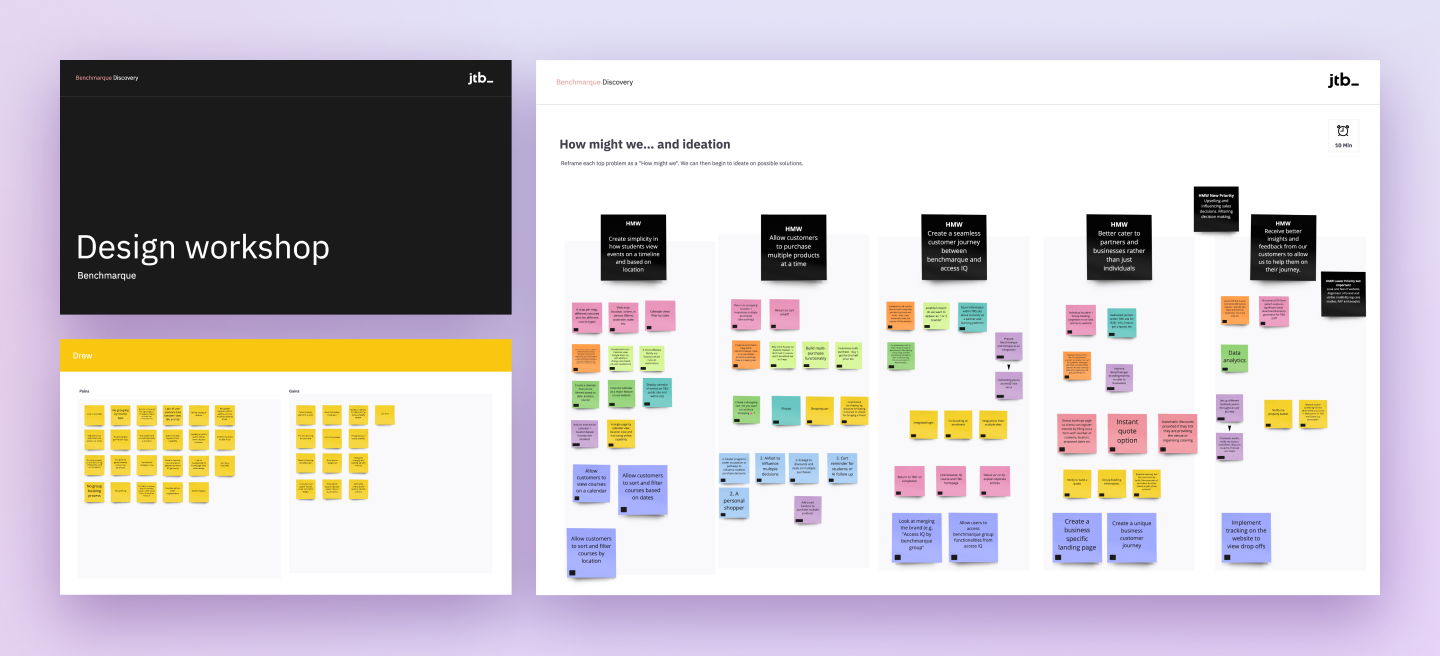
We approached the project in two distinct phases. The first focusing on understanding the business, audience, pain points and solving the customer journey problems. Secondly we applied the visual rebrand over the top of our customer journey improvements.
We began with a number of workshops involving key stakeholders from all areas of the business.
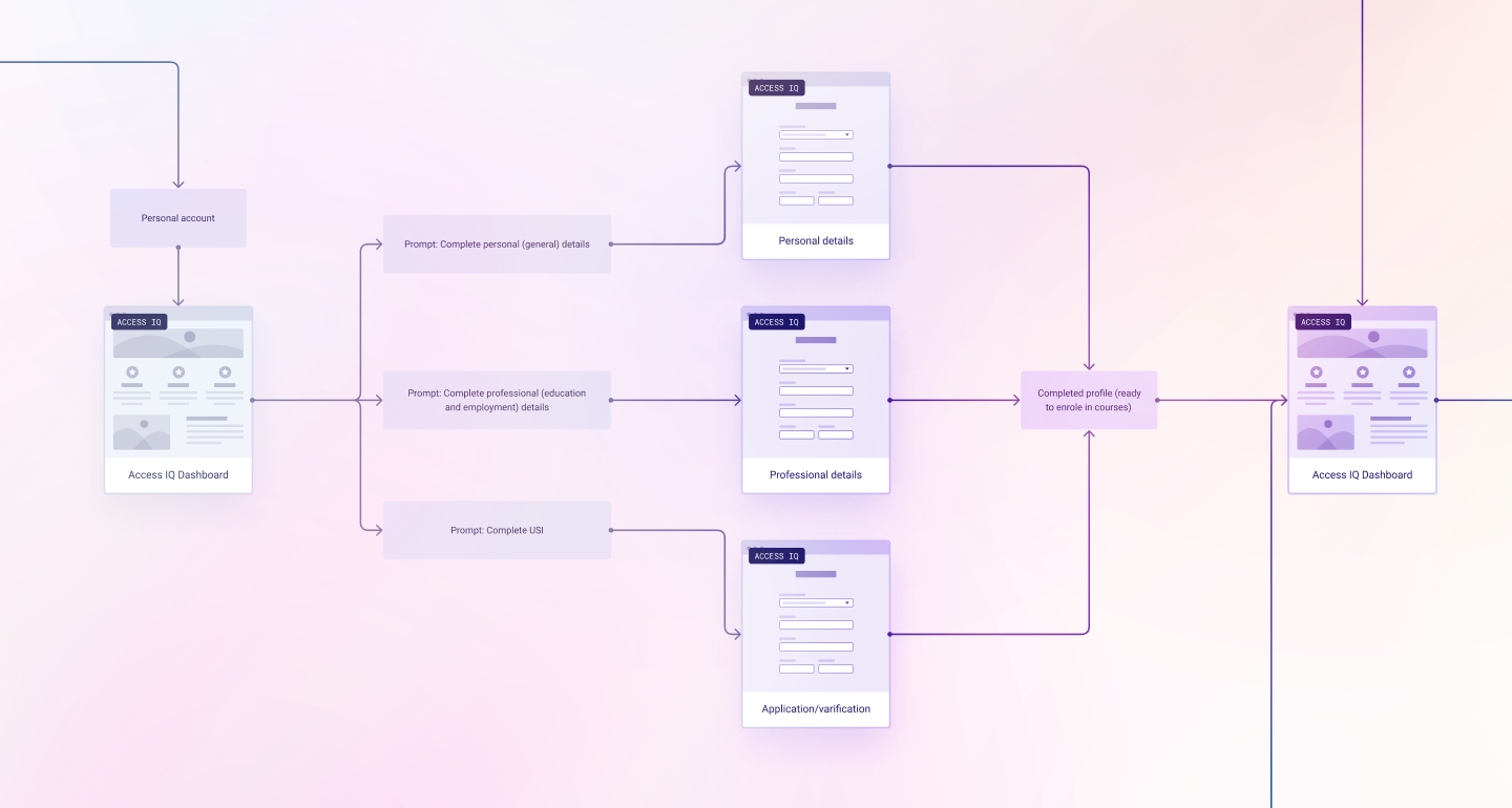
User journey breakdown
There was a confused experience when customers moved from an exploration phase into the purchasing and signing up phase. Some user’s failed to understand what was required to sign-up for their chosen course.
A one for all approach
The approach to communication was unpersonalised, even though the business had the data to personalise communication. All users received the same information, all of the time.
Visual misalignment
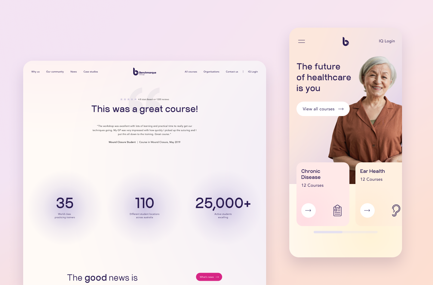
The website visuals were not aligned to the brand and had dated unfavourably. The experience was also different to what users saw when they attended workshops and courses in person.
Once we understood the core problems within the journey we were able to define a solution and apply the visual uplift the brand required.
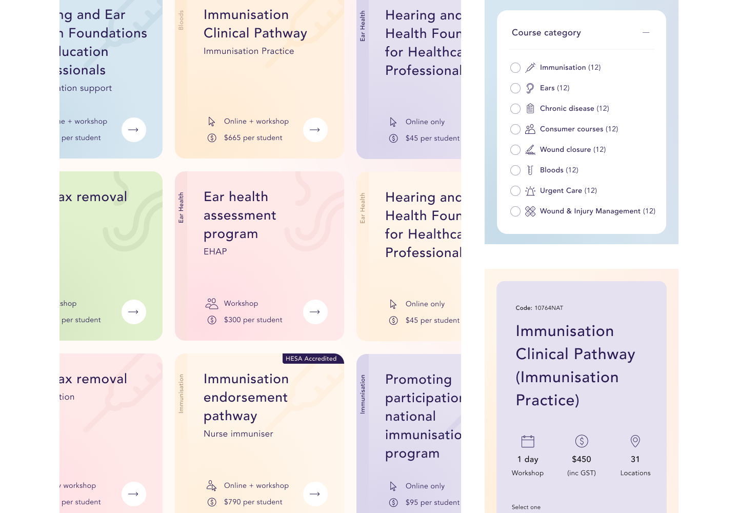
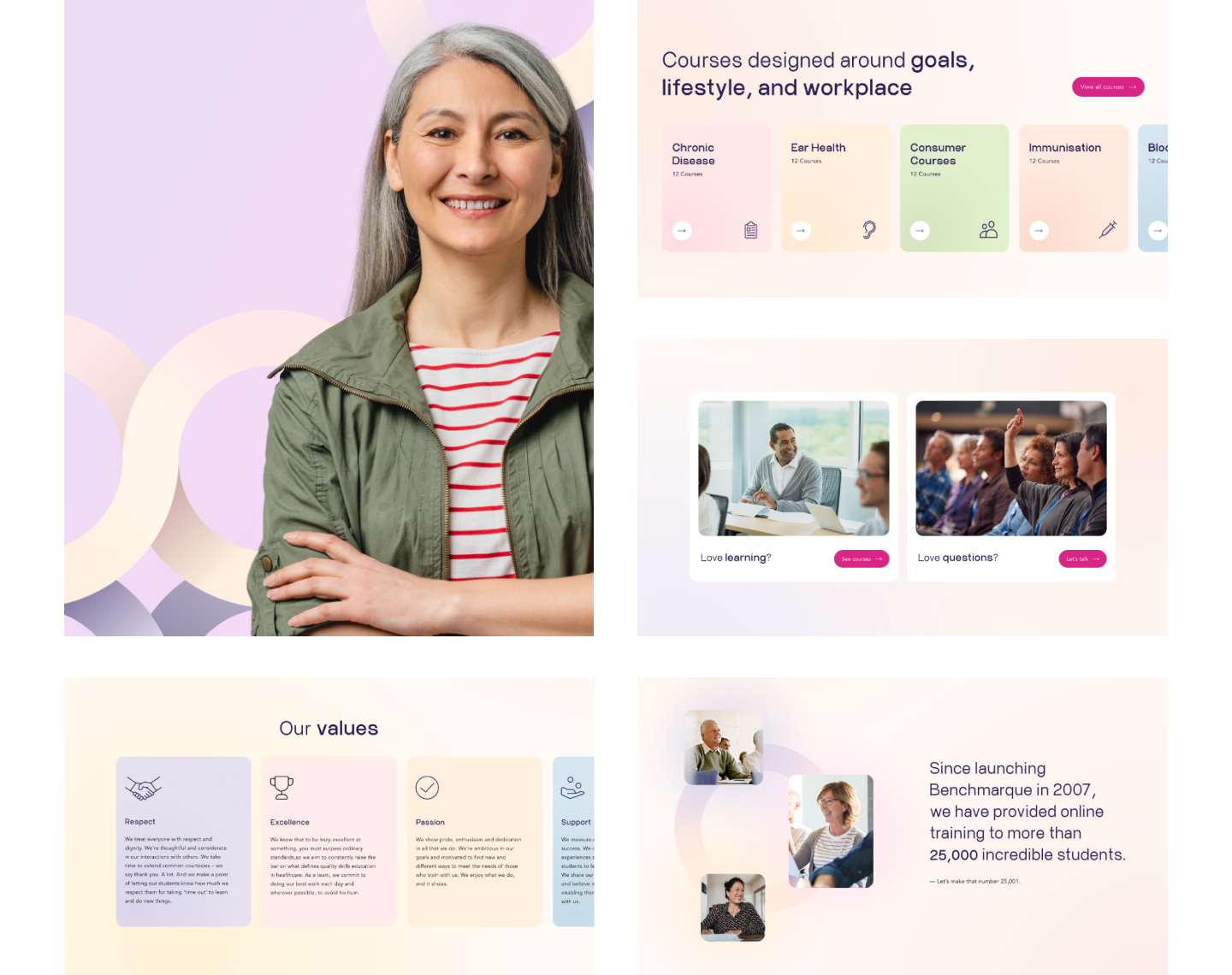
Findability and categorisation
Course discovery was overhauled—creating a consistent journey for users. Each category was colour coded and given a unique icon. The course tiles were updated to contain the most sought after information before the user committed to a tap through to the course page.
The right details at the right time
The course information pages were a dense page of information, with little hierarchy. We pulled important chunks of information to the top of the page and beefed up the sticky sidebar to contain the most relevant points to the majority of users.
Clear call to action with obvious next steps
The call to action copy to apply to a course was updated to provide better information scent, giving the user an indication of what they could expect to come next.