New year, better website. Simple tips for getting more sales!
Unless your goal is to waste money, it’s highly likely that the reason you have a website is to generate revenue for your business. This guide shares some common website tweaks, to help you make a few extra greens this year!
Intro
We all have our own definition of success, and for the context of this guide, we will simply define it as progress: “movement toward a higher state”. Progress is measured by getting results, which should usually be very-specific–but we’ll make an exception here–and say the desired result is to generally increase the overall conversion rate of your website, which in turn leads to more sales.
Getting started (required)
In order to measure progress, you first need to benchmark the current state of your website. The way it works, is to measure the amount of page-views you have against the visitors who actually take action.
For example: Let’s say you’re a local Real Estate company, and your main call-to-action is for people to call your business. In this case, your CTA (call-to-action) is a phone number like 1300 123 123.
Tracking a phone number compared to a contact form used to be very difficult, because how do you know if someone called from the website, Yellow Pages or off a business-card? Tricky, because they’re all the same number.
In this case, you can incorporate what is know as call-tracking. Essentially, this gives you multiple phone numbers that all redirect to your primary number. So you could have a different number on your website and business card, but they would both call through to your primary number.
The nifty thing is that these alternative numbers are tracked online, so you can see the amount of inbound-calls from each number, meaning you can single out how well each of them is performing.
Say you have 1,000 pageviews on your website, and 50 out of those 1,000 people call the number on the website, that would mean your conversion rate is 5%.
To figure out your benchmark, all you need to do is add Google Analytics to your website (free). You can find instructions here. If you’re measuring calls as your primary CTA, then use a recommended call tracking service like Avanser.
Once you’ve added them, made sure they’re working, and don’t make any changes to your site for between 2-4 weeks. Then, record what your averages were during that time period (e.g. amount of page visits and amount of calls). This will give you your benchmark.
Now for the fun part, tweaking your site to bump up that benchmark!
1. A/B testing
Imagine A/B tests like a science-experiment. You have a hypothesis, isolate a single factor, make a change and see what the effect is (positive or negative).
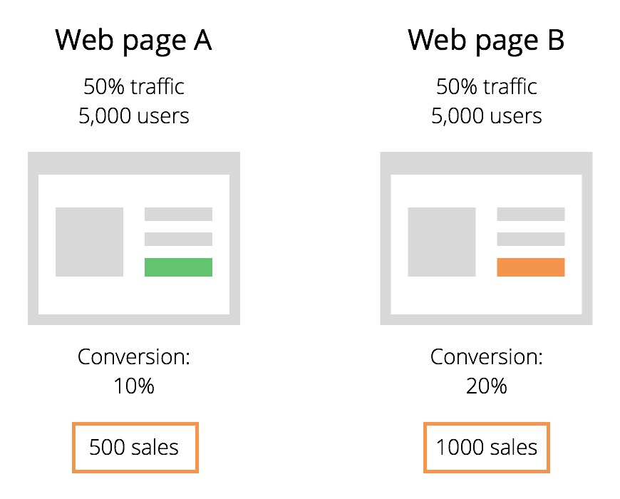
Example: In the graphic below, we have an A/B test where 50% of website visitors are sent to a version of the page with a green CTA button, and the other 50% are sent to a version of the page with an orange button. This is sending an equal amount of people to each page, with only a single difference, the colour of the buttons.
One version has a green button, and the other has an orange button. As both pages are being tracked, with only a single difference, you’re able to see what page actually makes more sales.
This is one website optimisation that you can use on a constant basis, and see what gets the best result.
2. Make your forms more user-friendly
Nobody likes filling out forms. You don’t like filling out forms. What’s the chance of the visitors on your site hating them too? Very high. 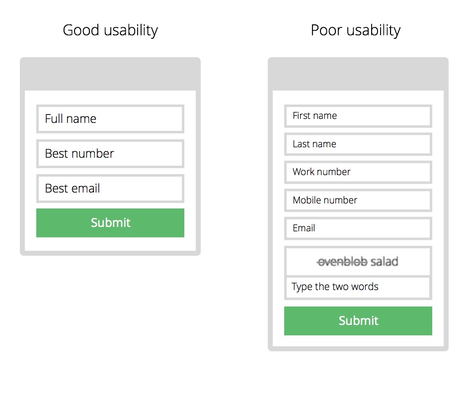
Only include fields that are absolutely essential, and try combining fields. Instead of having separate fields for first and last name, just make a full name field. Instead of asking for separate work and mobile numbers, just ask for their best number.
Make your fields readable, no-one likes tiny little fields with text they can’t read, especially on mobile devices. Make each field easy to read, with a large, clean font.
Finally, you’re never going to find someone who enjoys filling out Captcha’s. You know those little boxes with obscure characters that you have to guess. Instead, just don’t include one–and if you absolutely need the spam protection–add a reCaptcha instead.
3. Use contrast on your call-to-actions
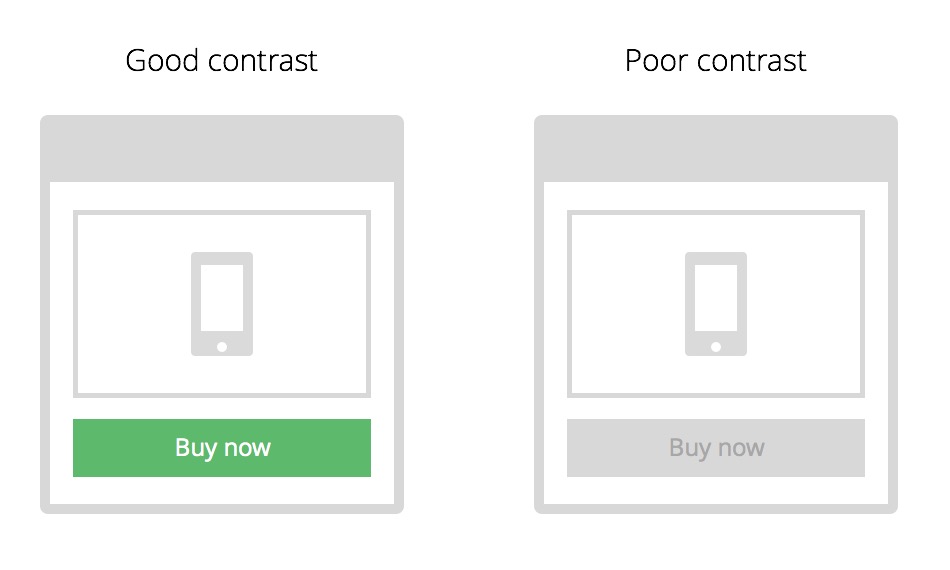
Don’t keep your call to action buttons a secret. Contrast is one of those ‘simple but powerful’ things that can increase conversions significantly.
Imagine you’re driving, right. When traffic lights are coming up, there will be a sequence from Green > Amber > Red. Each light represents a stage: Go > slow down > stop!
BUT, only one colour is shown at a time. Can you imagine how confusing and dangerous it would be if multiple colours were shown at once? A big reason why traffic lights are so effective is because they only show a single state at any given time, with colours that stand out.
This is exactly how call to actions need to work on your site. Think about it: contrast. When that light turns green, illuminated from its bright colour and dark background, you know exactly what action to take, there’s no confusion about it (hint: slow down).
If your call to actions are littered throughout your website, and crammed amongst a bunch of content with conflicting colours, no one will notice them.
It almost sounds too obvious to be true, but you would be surprised by how many websites are a Where’s Wall-e of call-to-actions.
In summary, make your CTAs so obvious that people can’t resist but to click them.
4. Better copywriting
Stop trying to sound sophisticated with jargon. The best copywriting ‘tip’ is to literally imagine that you’re writing directly to the person using your site.
Imagine you’re having a verbal conversation over coffee with them, and they have absolutely no prior knowledge of your product or service. To really put the pressure on, you only have 30 seconds to explain it to them. How would you–in laymen terms–explain it to them?
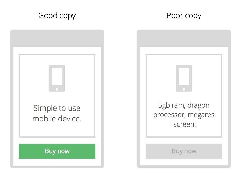
Generally, it’s best to use natural language that your audience can easily understand. Say you’re a mobile-phone salesmen: If you go around telling prospects that the device has: “5gigs of ram, a dragon 5000 processor and mega-retina screen”, they’re not only going to decline your offer, they’re going to think you’re a robot who lives in a dungeon.
No one knows what that stuff means. So instead, telling people that the device is simple to use, and fast at browsing the internet, will make what you’re saying more relatable, and easier for people to understand. A better understanding leads to more interest, and enough interest leads to a sale.
Head over to your website, and ask yourself the following questions:
- Am I really speaking to the right audience?
- Are my website visitors going to understand the language and phrases I’m using?
- Is there too much text, can I cut a lot of the junk out?
- How can I make the wording more natural and easier to understand?
At the end of the day, your average visitor will spend less than a minute on your website, so always keep the coffee-shop analogy in the back of your head.
5. Add urgency
Urgency is one of the more frowned-upon tactics used to boost sales. Using urgency on your call to actions is more beneficial to you than your customers, unlike all of the other tips mentioned above, which are mutually beneficial.
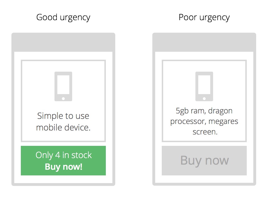
In essence, urgency is putting artificial-pressure on people to take action sooner rather than later. It’s like the Christmas sales. Just about every ad you see will use the following two urgency-tactics: Buy now before stock runs out, or, massive sale on now, ends new-years!
See what they’re doing? They’re using scarcity, by saying there’s limited stock or a sale ending soon. They do this to make the offer even more enticing, so that people think: “I better buy it before they run out of stock, or before the sale ends!”. Truthfully though, there’s an abundance of stock available.
The theory is that people are more likely to buy or take action the first time they come to the site. If there’s no urgency at all, then people start to think things like: “Great, I’ll just bookmark this and buy it later”, “Great, I’ll put this on my to-do list for when my next pay comes in”, or “Do I really need this?”.
When you have urgency though, it makes people more inclined to take action right now. Not tomorrow or in a week, but right now, when their wallet is wide-open. If they don’t, they might miss out on a great, discounted deal, or miss out on it altogether if stock runs out (or so they think).
This is a proven way to improve conversions and make more sales, but as Google say, do good, not evil.
Reminder: Don’t forget to check your sites Analytics to see how these changes improved your sales! We would love people to share their results in the comments section.
Not sure how to do all that stuff yourself?
Shoot through an email on our contact page for a free conversion rate audit. Simply include what you want to improve on your website, and the URL. You’ll be one step close to making more sales.
Blog
Projects


