10 Best Websites of 2023
The JTB Studios design team have outlined 10 of the best designed websites of 2023, and why they love them, plus rating and unpacking the digital designs they believe are leading the pack.
Not just about visuals; this selection is about strategic concepts that redefine what it means to be a digital brand today.
When we looked at the criteria for what we’d consider the best website, we thought about design, functionality, security, and integration – all integral aspects of website development, and each playing a crucial role in shaping the user experience and overall success of a website and brand.
So what is it that makes a website great? Below we go into how these elements interact and influence the best website designs:
- Design:
- Visual Appeal: Design is obviously the first impression users have of a website. An aesthetically pleasing and well-thought-out design not only captures attention but also communicates the brand identity and message effectively, and memorably.
- User Experience (UX): Design affects how users interact with the website. An intuitive and user-friendly (mobile first) design enhances the overall user experience, making navigation smooth and enjoyable.
- Functionality:
- User Interaction: Functionality is all about how the website works. Interactive elements, such as navigation menus, forms, and dynamic content, contribute to a positive user experience and keep visitors engaged.
- Performance: Website functionality also relates to performance. A fast-loading site with smooth transitions contributes to user satisfaction and helps retain visitors.
- Security:
- User Trust: Security is crucial for gaining and maintaining user trust. A secure website protects user data, transactions, and privacy. Security measures such as SSL certificates and encryption are critical for safeguarding sensitive information.
- SEO Impact: Search engines often prioritise secure websites. Implementing security measures can positively influence a website’s search engine ranking, indirectly affecting its visibility and traffic.
- Integration with Other Parts of the User Journey:
- Seamless Experience: Integration ensures a seamless user journey across different touch points. Whether transitioning from social media, email campaigns, or other platforms, a cohesive experience enhances brand consistency.
- Data Flow: Integration facilitates the flow of data between various components, such as CRM systems, analytics tools, and third-party services. This data flow is crucial for informed decision-making and personalised user experiences.
The best websites connect these various elements, and their effective combination is essential for a holistic, strategic website that converts. A visually appealing design, coupled with seamless functionality and robust security, contributes to a positive user experience. Integrating these components with other parts of the user journey ensures a cohesive brand presence, fostering user trust, and ultimately impacting the success of the website.
So let’s get stuck into it. Here’s our picks for 2023:
10 Best Websites of 2023
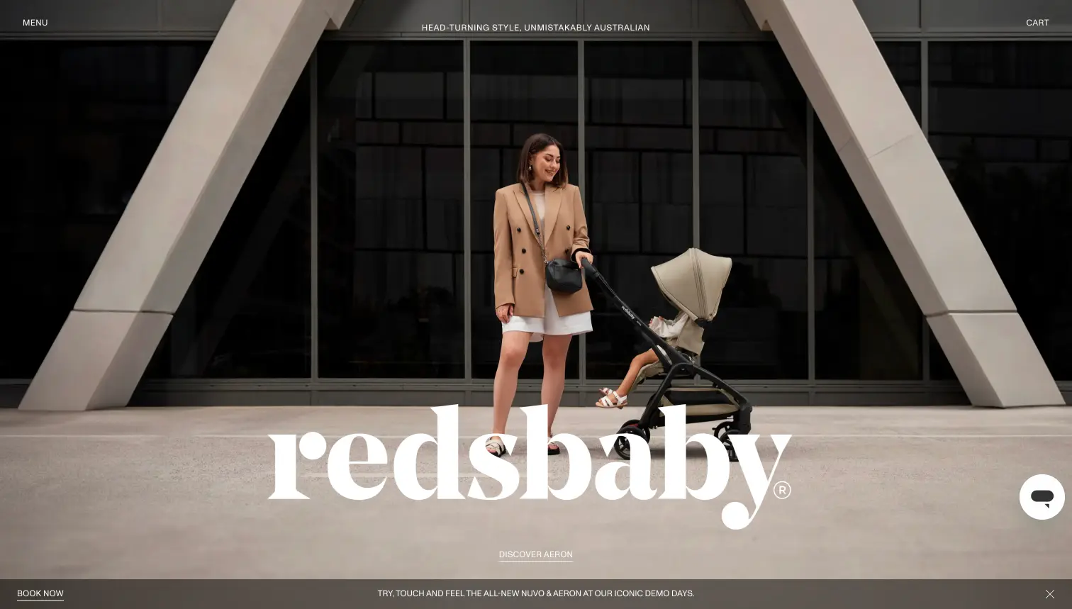
Redsbaby
Nightjar – Australia
Ecommerce: The best in baby products and experiences.
Why we love it:
- A great brand refresh and digital elevation
- Modern design, but not focused on ‘trends’
- Represents the quality of the products well and aligns the brand with the price point
- Caters to the audience well by focusing on two areas well: ‘specs’ and ‘style’
- Shows off premium lifestyle well, while also showing detailed information where needed
- Beautifully crafted with a really simple and elegant user experience at the core.
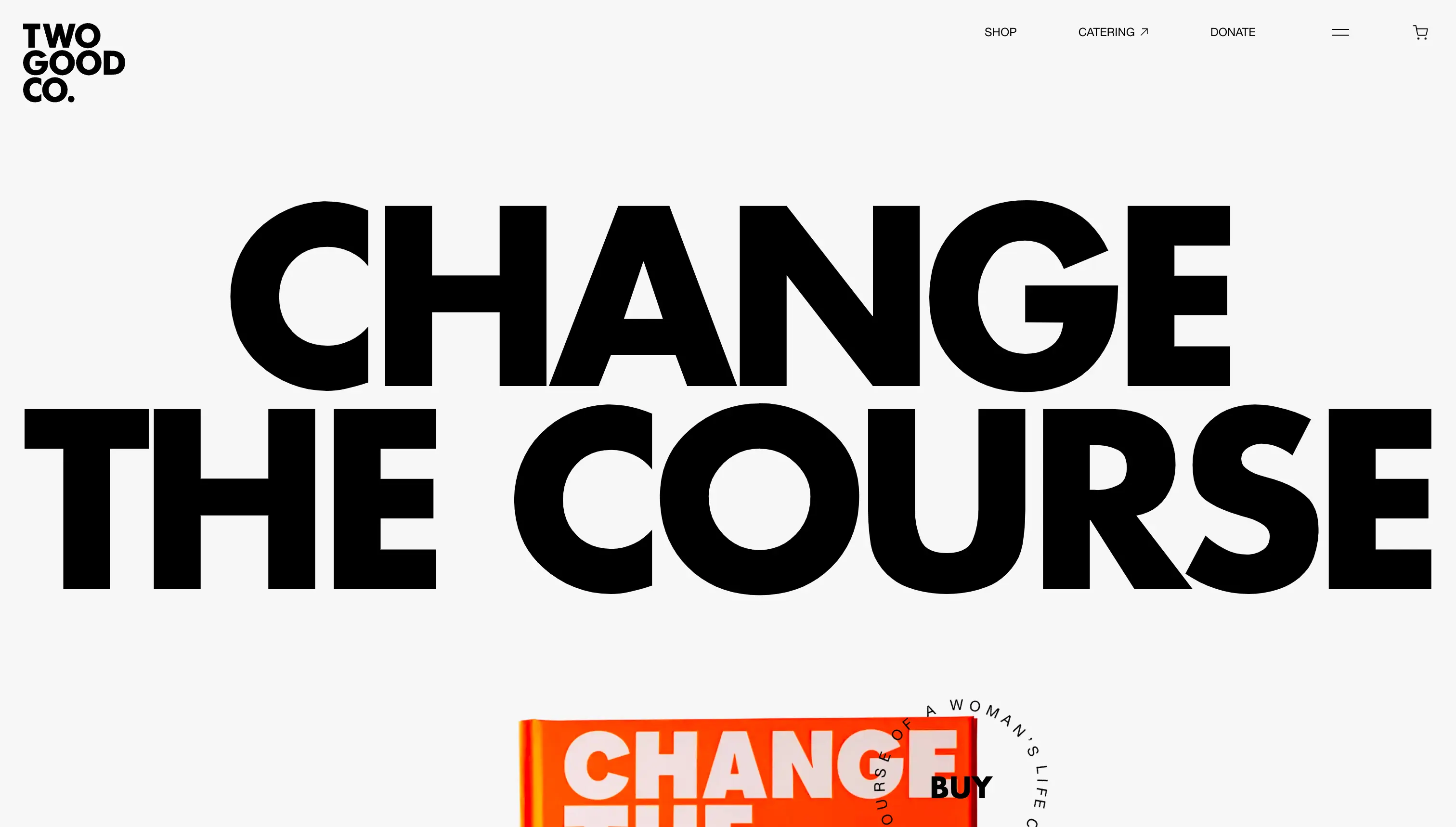
Two Good Co
Nightjar – Australia
Ecommerce/Social Enterprise: Supporting, empowering and employing women with lived experience of homelessness, domestic violence and complex trauma, through the creation of beautiful, high quality food and products.
Why we love it:
- A focus on craft and execution of good design through typography and layout
- A simple experience that communicates the brand idea effectively
- Some really interesting ecommerce elements that have been done in a different way to the norm, but work really well for the product
- Beautiful imagery throughout that adds value to the experience and is more than just filler content
- Great cart and checkout experience.
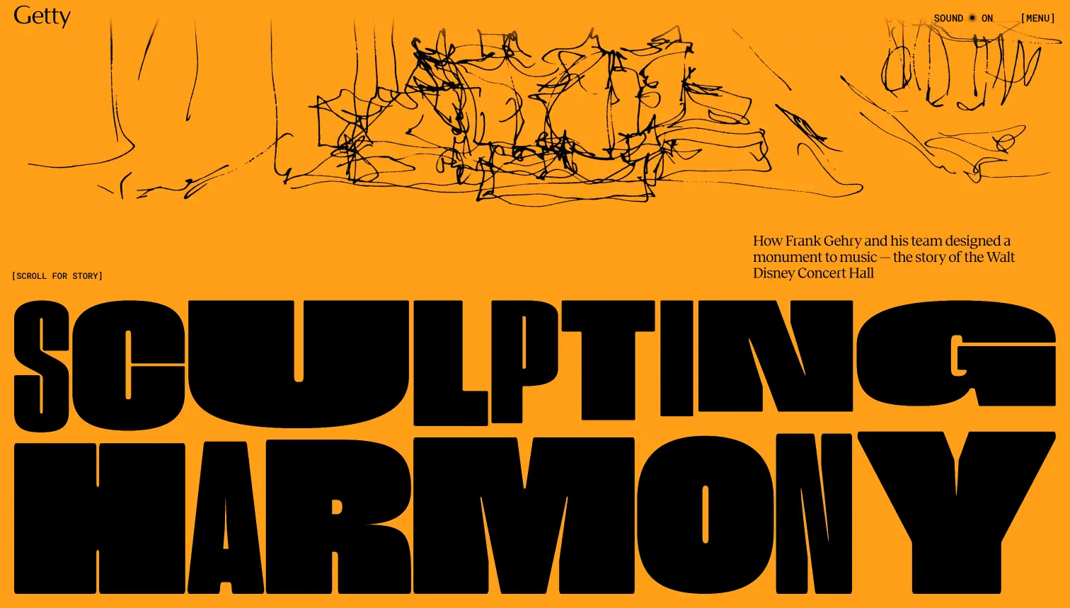
Sculpting Harmony
Resn/Getty New Zealand
Storytelling: a digital exhibition showcasing the innovative design of the Walt Disney Concert Hall.
Why we love it:
- A first class example of a digital exhibition done well
- Great storytelling with a mixture of video, imagery, sound and text
- The assets have been created for the experience and this comes through in the quality of execution
- Lots of interactive elements to keep the user engaged and not just sitting back watching (as an in-person exhibition would also have)
- Really interesting typography and animation approach
- Despite the complex nature of storytelling the experience is exceptionally easy to navigate.
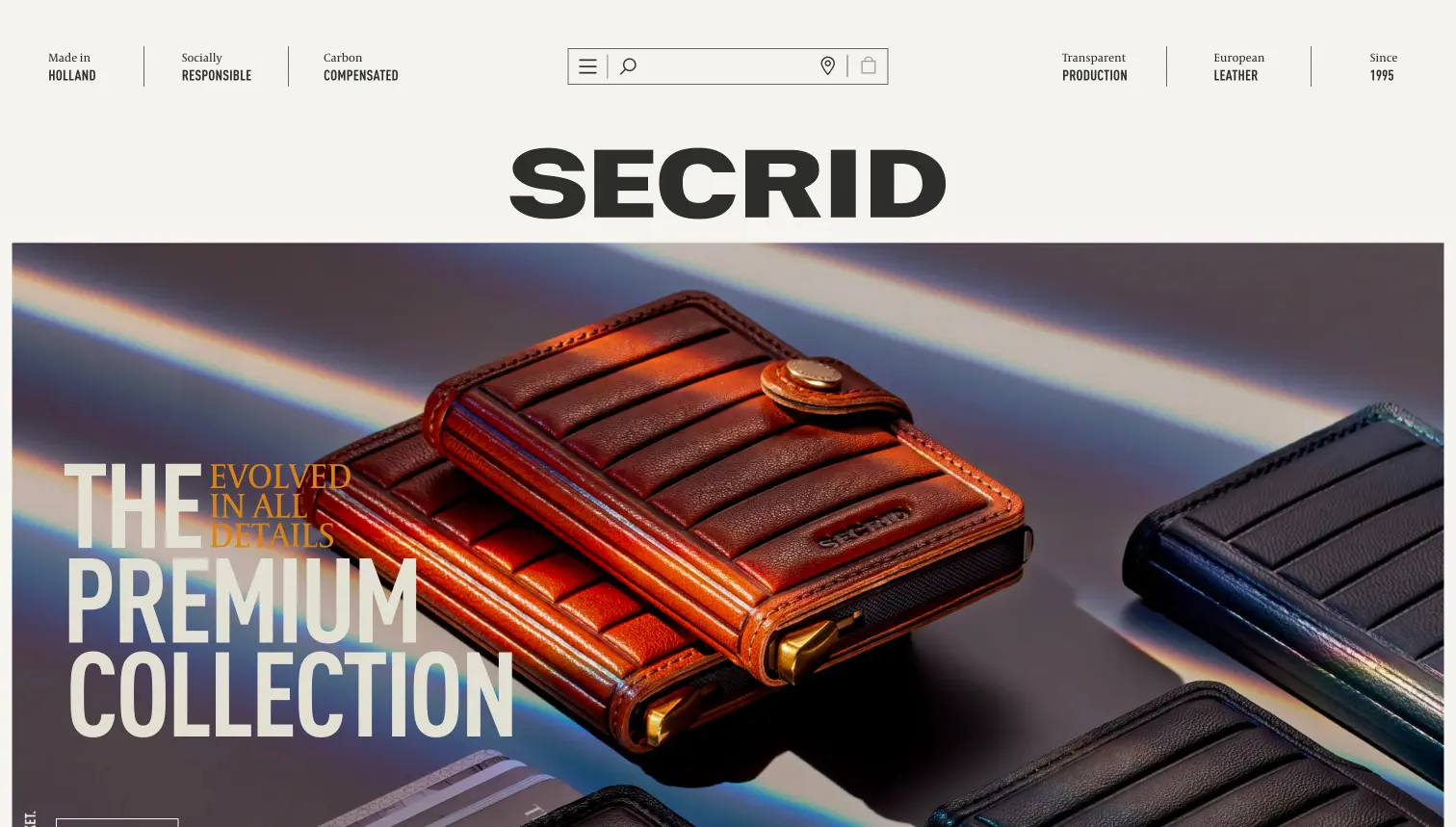
Secrid
Built in Amsterdam – Netherlands
Ecommerce: Dutch Wallet makers since 2015, a creative journey that changes the way we look at daily essentials.
Why we love it:
- Some really different and innovative navigation techniques used that work really well
- A strong design language connection between the offline and digital stores connecting the two brand worlds
- Really nice art direction throughout and a considered approach to product imagery and what a user might need to see
- Really strong coherence to the brand work, outdoor activations, and the website
- Products have video demonstrations of how they work
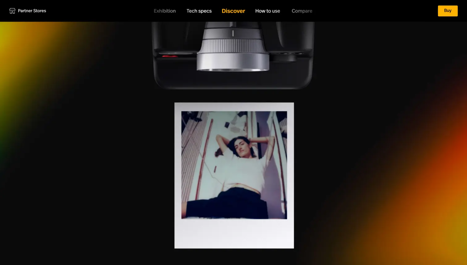
Polaroid
Built in Amsterdam – Netherlands
Ecommerce /Product Demo/Storytelling: beautiful tools to capture the meaningful moments in life.
Why we love it:
- One of the best examples of product storytelling
- Really well-executed visual brand queues throughout
- Great link back to the primary website and store
- Users can almost ‘feel’ the product
- Works brilliantly on mobile
- Great aesthetic of past and present merging effectively to communicate the product
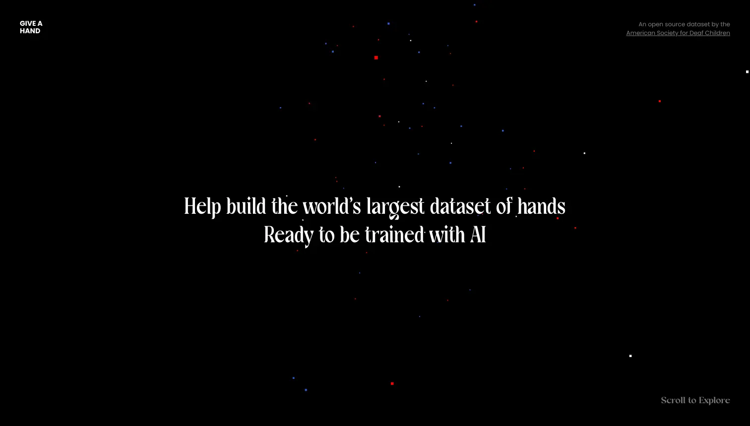
Give a Hand
Hello Monday – USA
Data Visualisation/Storytelling/technology: the world’s largest open-source hand library to help AI unlock Sign Language.
Why we love it:
- Great idea using technology to help people
- Enhancing communication through data
- Beautifully presented gallery of data
- Extremely easy to add to the project
- Turning data into something beautiful – but also extremely useful
- Clear call to actions
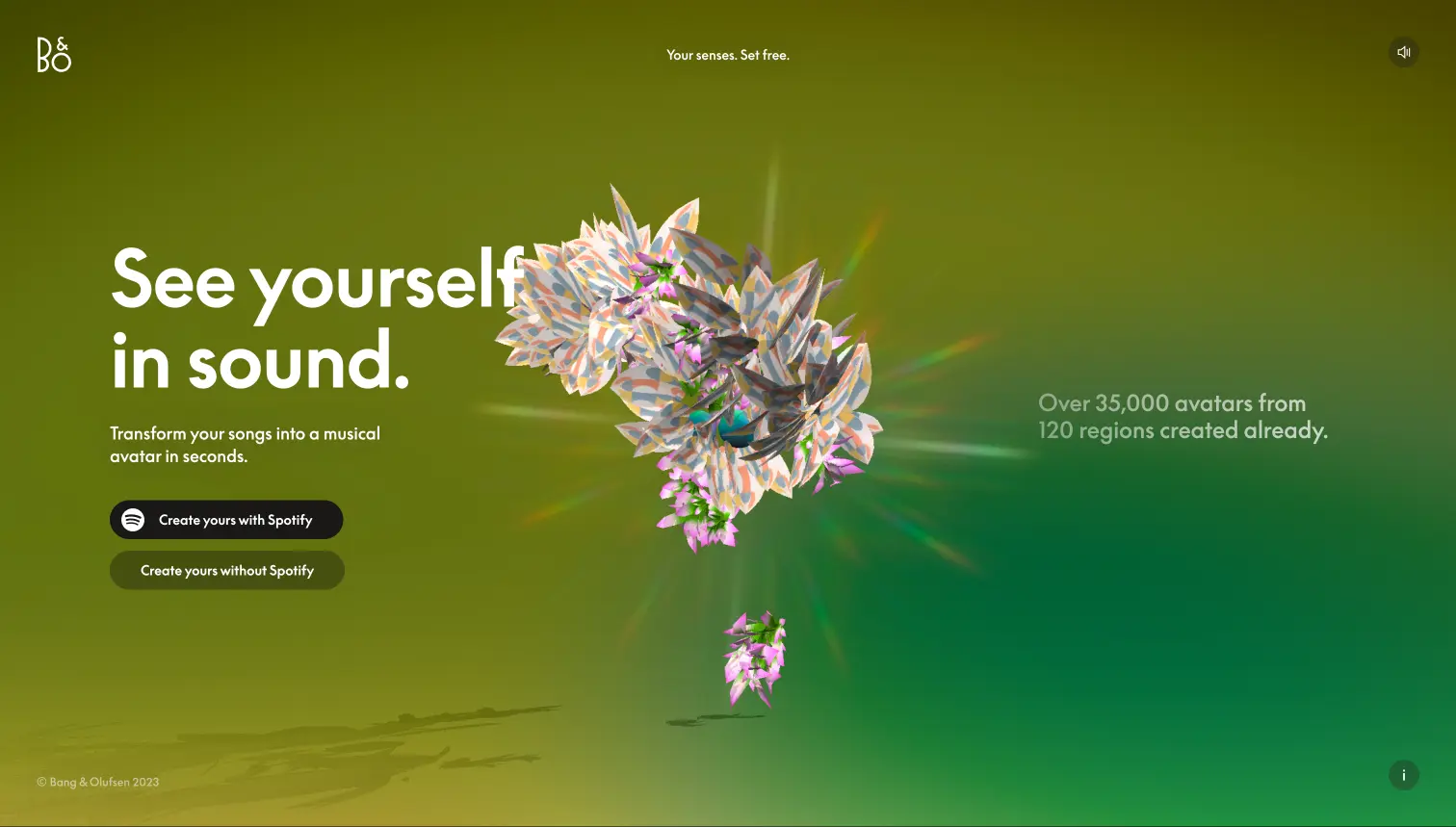
See Yourself in Sound
Hello Monday – USA
Data Visualisation: a digital platform that transforms your lifetime of listening into your own unique 3D avatar, ready to share with the world.
Why we love it:
- Extremely personalised experience
- The idea fits the brand well
- Easy integration with Spotify
- Quick and easy to go through the experience and is genuinely fun
- Extremely shareable
- Creates hype and interest in the brand
- The behind the scenes of how it works is very clever and a great use of different technologies
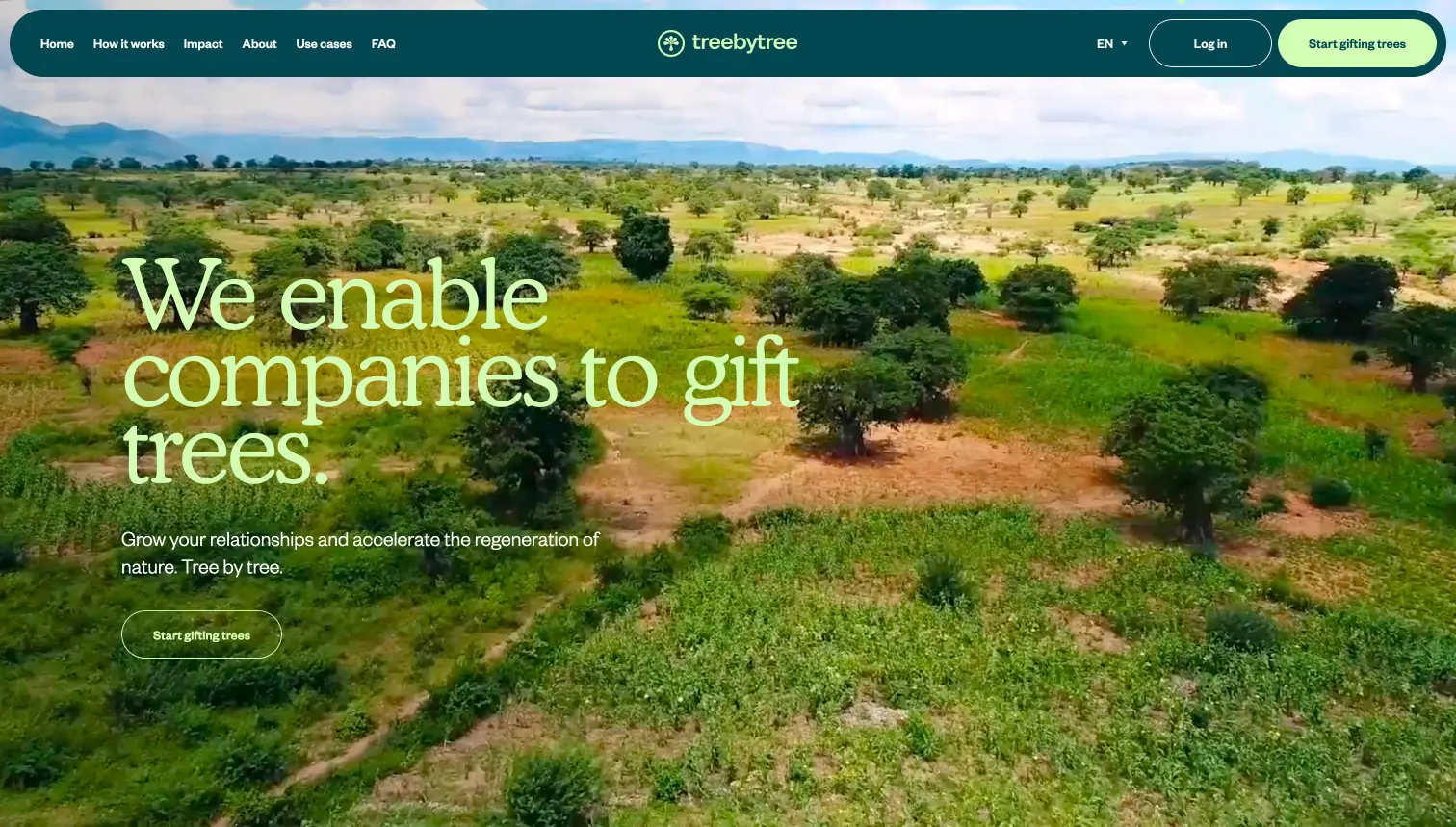
Threebytree
Lama Lama – Netherlands
Corporate/Social Responsibility: enabling companies to gift trees.
Why we love it:
- The idea and aim of the business is explained succinctly and simply right from the homepage
- Great assets
- Beautiful brand execution
- Colour is used in interesting ways
- Clear call to actions throughout and the user journey is simple
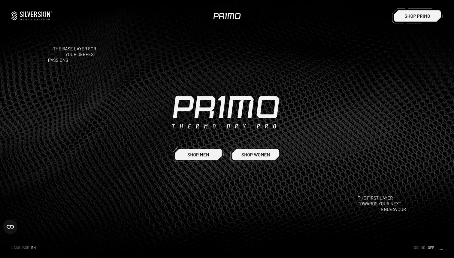
Primo by Silverskin
Playground – Italy
Ecommerce/Storytelling/Product Showcase: silver-fibre base layers with specially constructed fabrics that enhance athletic performance, whatever the environment.
Why we love it:
- A great mix of technologies to elevate the product (3D, motion graphics, webGL animations)
- Does a great job of making the fabric feel tactile in a digital experience
- Good connection and cohesion with the primary store website
- Really nice art direction
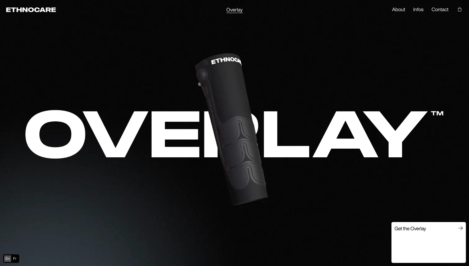
Ethnocare
Locomotove – Canada
Ecommerce/storytelling/product showcase: challenging the orthopaedic industry by providing innovative solutions that improve users’ lives.
Why we love it:
- Great use of bespoke assets, video, imagery and animations
- Great, linear user journey and storytelling aspects
- Clear, single-minded call to action
- While centred around a single page scrolling experience, the rest of the website is built out with craft and care
- The feeling of the product comes across on the screen
We’d love to learn more about your business, your own website inspiration, and how JTB as an agency can help create a strategic and engaging solution for your brand.
for more information or reach out to arrange a chat. We’d love to learn more about your project.
Projects
