A Good Website Flow is Better For Your Cashflow
Nowadays, all the information in the world is just a Google search away. Need to know the name of the song you just heard? Easy, type in the lyrics. How about a helicopter ride into work to beat the traffic? Well, you might need some Magic for that.
The catch is, with all that information available, we are easily-susceptible to overload. You can find yourself looking for items online for what seems like an eternity—and being the diverse humans we are—we all search for things differently.
A great (and humorous) example of this is a sketch from Google Analytics:
As shown in the video, sometimes you may have all of the right keywords, but the order in which you typed them does not lead to relevant information.
When it comes to your online business, it’s especially important to understand how your customers find information. People just want to find what they’re looking for in the quickest manner possible—that’s how our brains work. We filter things by taking the path of least resistance.
When we can’t find what we’re looking for instantly, we rage out into our 5 year old selves. Huffing, puffing and abusing our screens, we throw a tantrum and scream out loud: “is it really that hard to find some darn #*&@ skim milk!”.

You need to assume most of your visitors are impatient people with low attention spans. They want the thing, and they want it now. So help them find the thing. If you don’t, they will find the thing on another website, and possibly rant about you on a Google Review (you don’t want that, right?).
So the question is, how do you make it easier for people to find the thing on your website?
I’m glad you asked. Here are some suggestions:
Add an obvious search bar
We are so accustom to “just Googling it”, that whenever we go to an online store, we expect their to be some sort of search functionality.
Don’t make the same mistake the video above does, and ensure the search on your site is comprehensive. If you have a shoe product called “Nike Air’s”, it makes a lot of sense to give it a few more common values that can be searched:
-
- Colour: “white”, “black”.
- Size(s): “small”, “medium” and “large”.
- Availability: “in stock”, “out of stock”.
Having these values make it really easy for people to find what they’re looking for, because they can type in things like: “Large white nike shoes”, instead of having to use a bunch of filters and search through endless amounts of pages. If the product is “out of stock”, you can simply omit it from the site.
In addition, make sure it has natural-language searching, so that if someone types it backwards as: “Air Nike’s”, it would still come up.
Tailor the information you provide
Don’t give people what they don’t want. Just as much as you don’t like eating food you don’t like, people don’t enjoy irrelevant search results. The Iconic does a great job at this by giving people who land on the site two options: women or men. Then, everything from that point onwards is going to be much more specific.
Not only does it tailor all of the results thereafter, it completely limits the options to choose from. When you are able to make people think less, you make it easier for them to make a decision.
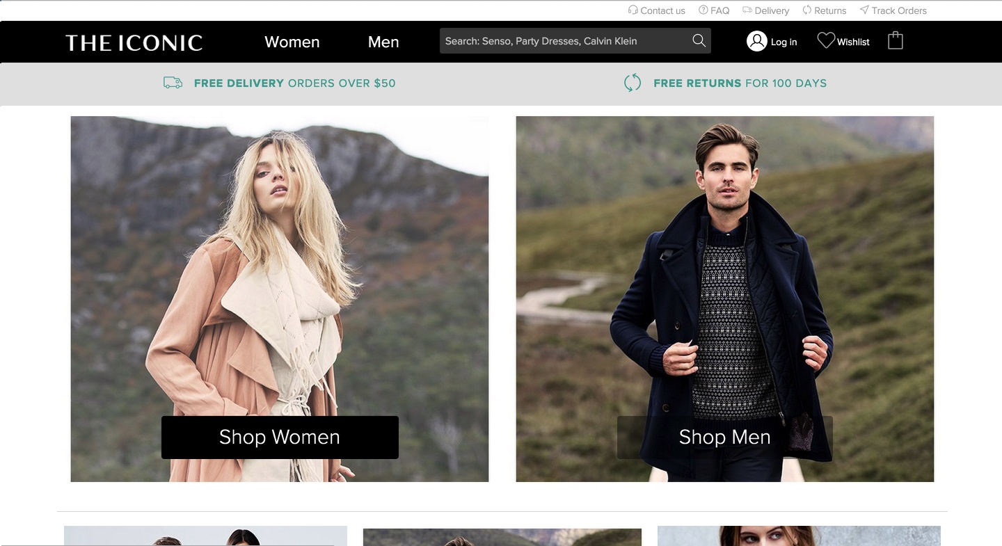
Whereas you have other sites that FLOOD people with so many options, that it’s not at all obvious what to click (nor are 90% of the options to choose from relevant).
Know your customers 3 most important filters
Again, you want to make it stupidly simple for people to make a decision. You essentially want to make the decisions for them. Giving people complete free will doesn’t make sales. Giving them a clear direction does.
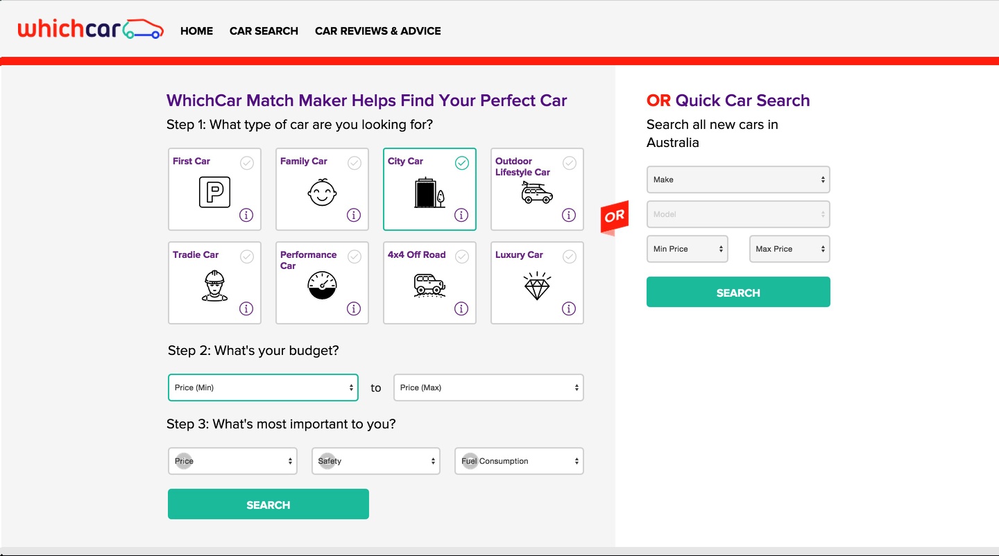
A great example of this is Whichcar. They take you through three simple steps when you first land on the site. Each step is simple enough for anyone to understand, and they take advantage of natural-terms like “first car”, “family car”, as well as big icons that get the point across effectively.
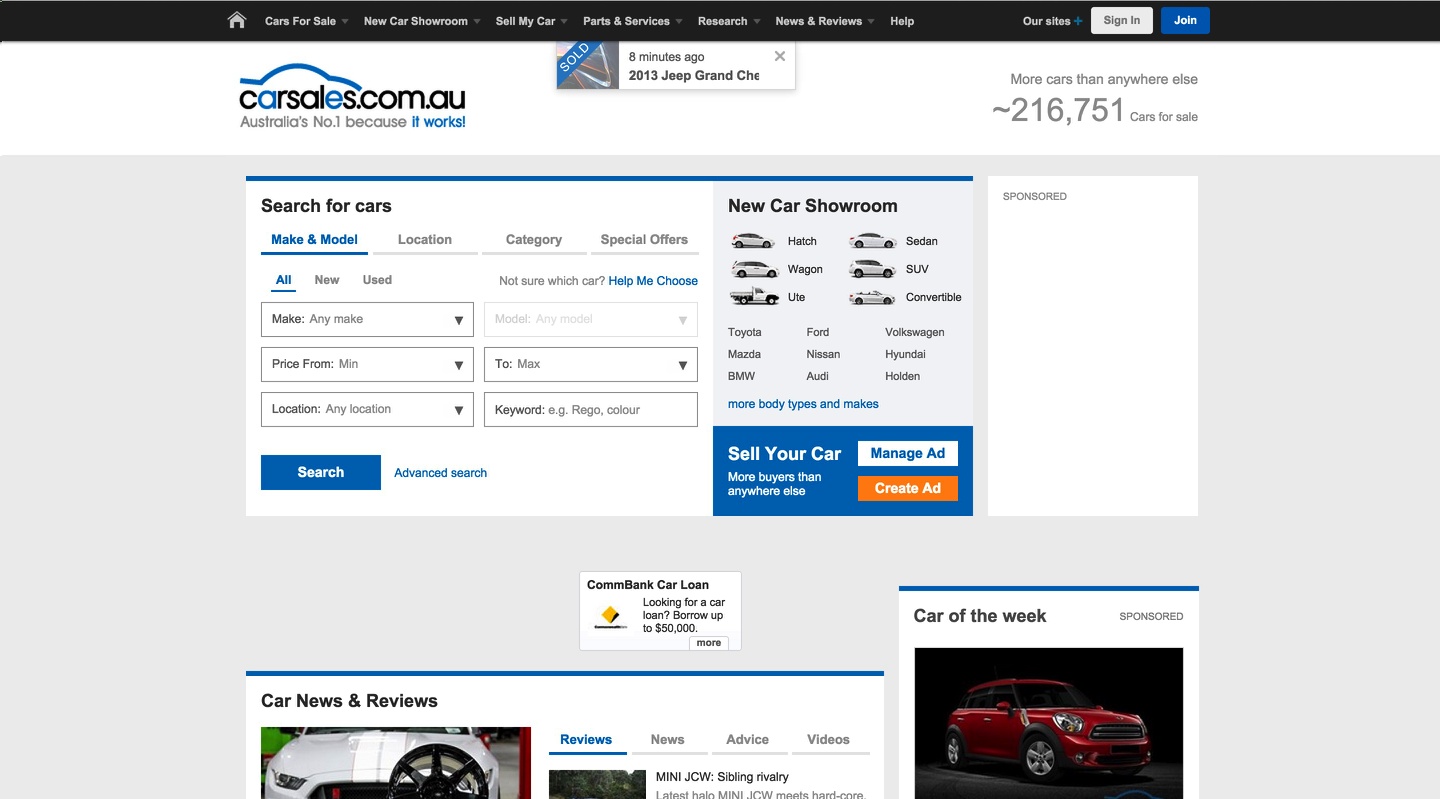
On the other hand, you have Carsales, who try to cram in way too many options at once. Not only that, they don’t have steps like Whichcar, so there’s no real reference point as to where you start.
They also prioritise a bunch of dropdown menus over their visual counterparts (the images to the right)—which, for a car website—doesn’t make a lot of sense, considering it’s a very visual medium.
Takeaway:
The more dumbed down the better. The faster you can get people relevant search results, the more likely you are to convert them from a visitor to a buyer.
Projects
