Google’s new ‘Mobile Friendly’ label and how it affects the traffic to your website
Remember back in high-school how you put off your homework until the night before it was due? Well, the same habit has stuck with many business owners over time. No matter how many times you have been reminded to make your site ‘responsive’ or ‘mobile-friendly’, you’ve put it off. Well guess what, your deadline-extension is well overdue!
OVERVIEW
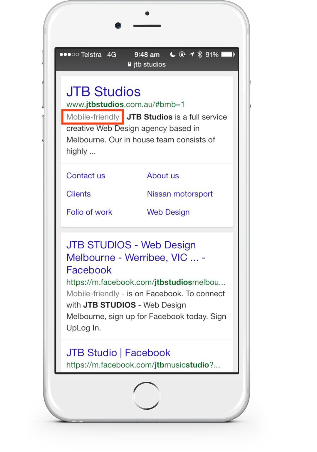
Just like the score on your high-school report, your website is given a score by Google. You get points for following best practices, and points deducted for bad habits and breaking the rules. Google have just released a little ‘Mobile-friendly’ badge for searches made from mobile-devices (see image below). The implications of this on the surface might seem small–it being just a little badge–but what’s going on behind the scenes is what should motivate you to go mobile. 
HOW THIS CHANGES THE GAME
For many reasons, this will impact websites for better or worse. See below for a few points on what the implications are.
1. Bad user-experience:
People are getting increasingly frustrated when visiting websites from their mobile device. They open a site, only to find out there’s no mobile version–but instead–a clunky desktop version that’s unreadable, and barely usable. This completely ruins the users experience, and their first impression with your website (that is, your business).
Consumers are getting more tech-savvy, and as time goes on, if people see your site is not mobile-ready, they won’t even click through to it. Not only does this work against you in terms of losing customers and making less sales–as you’re cutting out an entire segment of your visitors by not having a mobile-ready website–it significantly increases your bounce rates (no, that’s not a good thing).
2. Increase in bounce-rates:
Bounce rates, as described by Google, are “The percentage of single-page sessions (i.e. sessions in which the person left your site from the entrance page without interacting with the page)”. This simply means that someone came to your site and left before they interacted with it. This is a big red flag for Google. This is a clear indication that the user had a bad experience with the page.
The entire purpose of Google is to provide the best and most relevant search results (okay, Ads are the exception). Google want to ensure that when someone searches for something, relevant search results are returned. Not only that, they want to make sure that when someone visits a site from the search results, the site provides the user with a good experience. If Google displayed a bunch of sites that people left straight away, then no one would use Google.
This means the impact of bounce rates are significant. If Google sees that 1,000 people have visited your site, and 950 people left without interacting with it, you will be assigned a bounce rate of approx. 95% (higher = worse).
3. Drop in ranking
As a result of not having a mobile website, and therefore having high bounce rates, it signals to Google that your website isn’t providing people with value. This means that your website is seen as less-deserving of a higher rank, because it ruins Google’s reputation.
Ultimately, Google’s new Mobile-friendly label changes both the perception of your website to visitors, and ranking by Google. Think of it like the butterfly effect, where small things have big implications. Just like how a little gust of wind can turn into a hurricane, a small label next to your website can keep you at the top, or drive you to the bottom.
WHAT YOU CAN DO ABOUT IT
There are several things you can do to avoid being penalised by Google, here are a few:
1. Use Google’s Mobile-friendly Test to determine if it recognises your website as mobile-friendly. If it does then you’re a-okay, and you should have a beer. If not, don’t stress yet, because the next point might be your solution.
2. If Google’s Mobile-friendly test doesn’t recognise your website as mobile friendly, but your site actually is optimised for mobile, then it just means something is not configured correctly. Refer to Google’s Select your mobile configuration guide to determine what the issue is.
3. See for yourself. Google has a very useful tool, called PageSpeed Insights, for benchmarking the performance and user-experience of your website. It gives your site a score from 0-100, for desktop and mobile. Select the mobile tab, and scroll down the page until you get to the User Experience section. If you see a message saying that your site ‘might not pass the mobile-friendly test’, then refer back to the first point if you haven’t already checked. If you see that your score is red, and below 90/100, then it means your ranking is going to be affected, because Google doesn’t think your site provides a good experience.
4. Go responsive! If you’ve tested your website with the tools above, and it’s clear your website isn’t mobile-friendly, then it’s time to stop putting it off, and get a mobile-ready / responsive version of your website developed! At the end of the day, investing in a new, mobile friendly website will be much more beneficial to your business than ignoring it altogether, turning off potential customers, and losing your rank.
If you’re looking to make your website mobile friendly, get in touch with us at: info@jtbstudios.com.au
Projects

