The State of the Art
The State of the Art – deconstructing current UI trends of award winning websites.
As we move past the halfway point of the year we take a brief look back at some recent awwwards.com sites of the day to see if we can identify which UI trends that are occurring with regularity and take a deeper dive to see what they add to the overall functionality and feel of the sites.
1. Mouse Trails
Easily the most popular UI device being used at the moment; with half of the sites we looked at featuring them. Mouse trails can add a lot of visual interest and excitement to the screen simply because they are non standard and therefore unexpected. From a functionality perspective, if implemented well, they allow the user to have more context for the elements on the screen that they are about to interact with. Think of them as being like a tool tip for elements on the screen, allowing more complex interfaces to appear more simple. For example on the 14islands site (below), the mouse trail changes to a play button when your mouse is over a video and changes to a link icon when your cursor is over a panel allowing the interface to be totally uncluttered.
User Benefit: High
Visual Benefit: Very High
Mouse trail turns to a tool tip for a dragable gallery

Mouse turns into a play button when over a video
2. Very Large Headers
Big headers are all the rage at the moment and they only seem to be getting bigger and bigger. The main benefit of having a very very large header is how impactful they are; you can really get over the key information you want the users to know right from the start. From a usability perspective it’s really nice to land on websites where you are not immediately overloaded with visual clutter and can digest the purpose of the site before making the next decision on what to interact with.
User Benefit: High
Visual Benefit: Medium
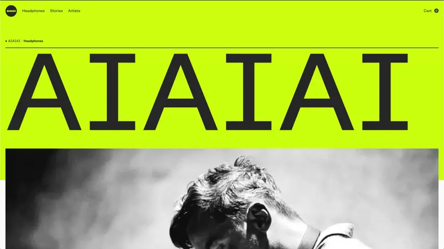
An impressive 400+ pixel header font form Aiaiai
3. Circles
This is definitely a new phenomenon but circles in interfaces seem to be appearing with more and more frequency. It’s less easy to define and identify the use case for circles but one possible use is to break up the grid and add some softness and flow to the layout. Another function of circles is that because they are so different your eye is always drawn to them and therefore you can use them for key information, or for a unique and distinct main button. They also lend themselves well to being used as a background to a hamburger menu button which can also be used as a nice transition into the popup menu.
User Benefit: Medium
Visual Benefit: Medium
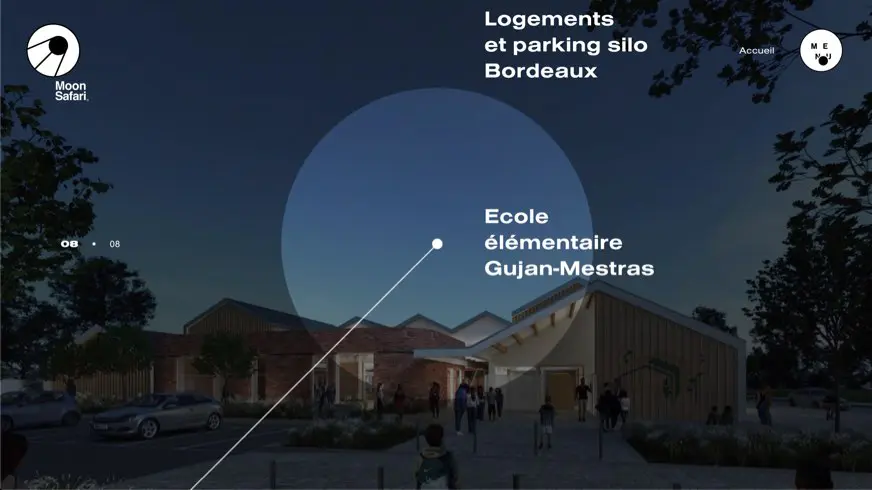
The Moon Safari site is built around circles, including a nice menu trasition
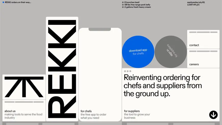
Circles on the Rekki home page function as key interactions
4. Bold use of Key Lines
Keylines are curious because of their dual function of being used to both divide elements and connect them depending on the context of where and how they are used. Keylines also allow you to divide content without having to use a different background colour to differentiate areas of content on a page which can lead an interface being stripey and thus allow the site to flow more and feel more cohesive as the user scrolls. Bold use of keylines feels fresh right now because previously many sites have tended not to use them in favour of Google Material Style cards or panels, which have become all pervasive in the last few years.
User Benefit: High
Visual Benefit: Medium
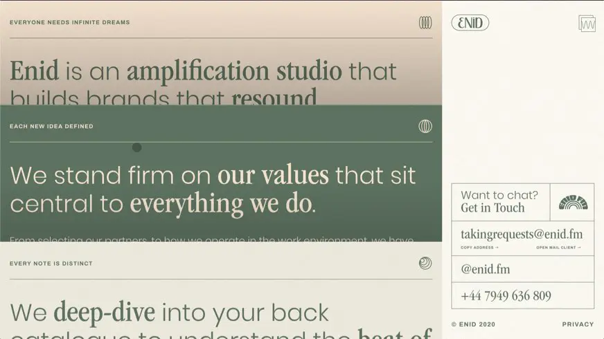
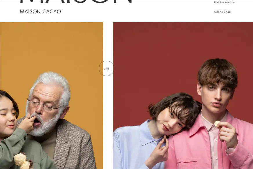
Key lines used to divide the headers and also to connect the contact details info
The Google Material approach starting to look dated?
5. Interesting lazy loads
Lazy loads are being taken to the next level with sites animating content onto the screen as the users scrolls in more and more creative ways. The benefit of the lazy approach is to allow the user’s eye to focus on what is currently on the screen before they scroll to the next content, and also the designer has the ability to influence what elements the users see and in influencing user behaviour.
User Benefit: Medium
Visual Benefit: High
Summary
Awwwards.com sites of the day are a really good place to keep an eye on new trends as they represent the cutting edge in website design. The question is… does having these devices in your interface mean that your work is more likely to win a site of the day? I would argue that you can not win a site of the day without including at least a few of these trends however the real goal, as always, should be to make sure that these devices are implemented to the benefit of the user.
Stay Safe.
The team at JTB Studios
Contact For Free Website Audit
Projects
