Web-design strategy that kicks ass & converts!
It’s a bird, it’s a plane.. no, it’s a low converting website that you need to do something about! There’s nothing worse than having a website that’s not doing its job. In todays post, we break down in detail what makes a great website, and more specifically, why a killer strategy makes your website a selling machine.
To start with a quote from a user-experience pioneer, the late Steve Jobs:
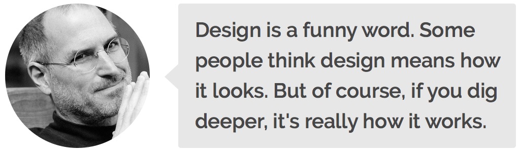
This simple philosophy spans across physical products like your iPhone and car, to software like apps and websites, and governs the amount of success that comes from them. Some praise the Swiss Army Knife for its impressive range of tools in a single knife, but others think that if push came to shove, a single, well-sharpened blade would be the victor.
The point is to focus on what matters. At JTB Studios, we base the websites we create off solid research and thorough testing, because without actually testing so called ‘best practices’ and assumptions, you’re just another person with an opinion.
See below for some common considerations when developing a winning website strategy (by strategy, we really mean how to make a website lots of money).
DECONSTRUCT
When starting a new website project, the first thing we do is a full audit of the business we’re working with. This helps us understand what the company does, who their customers are, what their main products and services are, and generally get a feel for the vibe of the company. We then work out what specific outcomes the business wants, so that when we’re building the site, it focuses on getting results in the areas that matter.
RESEARCH:
When it comes to research, we go above and beyond what many other agencies do. We don’t just Google “best practices for x-type of website”, we gather AT LEAST 20 websites in the same industry and break down what they do well and what they’re lacking in. We then start compiling a big list of ideas, and group them based on things such as: nice design, high-converting, great copywriting and cool effects. This gives us a pool of inspiration to dig into.
We then create customer personas that break down the characteristics of your top-3 customer types. For example, if one of your customers was a mom looking for baby clothes, we ask questions like: what is her worldview, what is she looking for, what motivates (and de-motivates) her, how tech-savvy is she, and what are her concerns. This helps us determine the layout and flow of each page, as we have a general idea of how each user-type will interact with the page.
The valuable information we gather from websites in the same industry and your target audience allows us to make informed decisions and build the website with a clear path to success.
MINIMAL:
Less is more. Keep it simple stupid. Simplicity is the ultimate sophistication. You’ve heard every quote imaginable already. The bottom line is that we are religious about reducing complexity and keeping things lean. From bullying our clients into one-page sites, to short and catchy titles, to moderate amounts of whitespace, we create websites that only include what’s essential. Nothing more, nothing less.
USABILITY TESTING:
At our studio, we aren’t the biggest fans of assumptions. People assume lots of things. The ‘conversion experts’ assume that bright orange and yellow buttons with excessive amounts of exclamation marks make people click more. The hipsters assume that everyone knows how a hamburger menu works (you know, the 3 horizontal lines). At JTB, although we are great at getting results based on our 10+ years of experience, we do thorough testing on the sites before we launch, to validate the assumptions we have made.
We do this by using services like Usertesting, where we get a dozen people to screen-record themselves testing the website, and watch how they navigate from section to section, page to page, and interact with the various elements along the way. Not only can we see how they use the page, but we receive verbal feedback of their frustrations. This is invaluable, because we can see how REAL people in the target audience use the page, before the site goes live to the masses.
Bonus tip: It’s also worth running a few tests on your competitors website(s) to see what people think. You will be amazed by what is uncovered.
SPLIT TESTS:
This stage of the strategy is not only really fun, it’s a stage that yields massive results. Split testing is essentially sending a percentage of the visitors to different versions of the website, and seeing which one performs better.
For example, you might create a version of the homepage where all of the call-to-action buttons are green instead of orange, and send 50% of the visitors to the page with the green buttons, and 50% to the page with the orange buttons. Then, you will track each page using analytics like Visual Website Optimiser and Hotjar to see which page make the visitors click the buttons more.
Part of an ongoing strategy that gets results is split testing and constantly tweaking the page to increase the conversion rate. Plus, who doesn’t like fun little experiments like these?
DATA DRIVEN:
In addition to split testing, we track a lot of data and user behaviour on each site, using analytics services like Google Analytics, CrazyEgg, SumoMe, and Wistia for video analytics.
This allows us to see key data like: what call to actions people are clicking, what parts of the page visitors are spending the most time on, how far people are scrolling down the page, what’s the bounce rate, and what’s the conversion rate.
We then extrapolate this data and make data-driven decisions to improve the page. For example: if the metrics are showing that 90% of visitors spend most of their time on the “products” section of the homepage, yet conversions for that section are < 5%, we can make a correlation that this section needs a better call to action (maybe an orange button instead of a green one).
Then, once we make a change to that section, we keep an eye on the analytics and see if the change made a positive impact on the conversion-rate. If it did, then it’s time to crack open a beer and celebrate, because higher conversions mean what? You guessed it, more cha-ching.
SMART CALLS TO ACTION:
Let’s be honest, the bottom line for most websites is to turn visitors into paying customers (to convert). Call to actions need to be crafted with precision to make an impact on a company’s bottom line.
When it comes to call to actions, there are so many factors to consider: placement of the CTAs, timing, contrast, colours, wording, and more recently, clever tactics using subtle animations and more advanced ‘under the hood’ functionality.
Here are three examples of ‘smart’ call to actions, that actually get people to take action.
This one is genius! FollowupCC have actually added a mechanism that can determine the position of the users tab, and track the position of the mouse in relation to it. When the mouse gets close to the tab (meaning the visitor is likely about to exit the site), they trigger a popup that offers a 14-day trial + 50% discount, enticing the visitor to re-think closing the tab, and signup.
EventAgent uses motion to increase conversions. Motion is what catches peoples attention and stands out from everything else. Long story short, humans were conditioned back in the cavemen days to have an acute sense of movement, to protect themselves from predators. Adding little wiggles and movements to call to actions implies a path to take for the visitor, which means your sales funnel becomes much more effective (there really is no such thing as free-will, huh?).
Talking about more sophisticated methods for CTAs, here’s an impressive on by Web Designers of Melbourne. They have a short little quiz that asks visitors to fill out a few questions. The nifty thing is that halfway through the survey, they’re asked for a few details like their name and company’s name. This is non-intrusive and doesn’t make providing a few basic details feel like a contact form. The interesting part is that these details are automatically stored. So if by the time they get to the contact form at the very end and don’t feel like filling it out, Web Designers of Melbourne at least have their name and company name, giving them enough information to hunt them down for a chat over the phone
All and all, we spend a lot of time and effort to make sure our call to actions are very effective, so much so that our clients get too many enquiries, rather than not enough.
WORDS THAT DELIGHT:
Last but certainly not least is great copywriting. After understanding more about the company that we’re working with, we can articulate what they do, and their services in a way that’s easy to read and understand for their visitors.
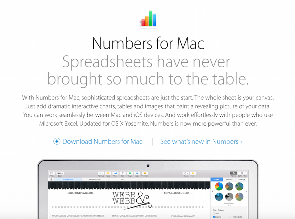
It’s all about creating such well-written copy, that is: clever but not over the top, witty but not a complete joke, and salesy but not sleazy. It’s about creating copy that just flows, and makes someone say “TAKE MY MONEY!” half way through a sentence. It’s copy that sells itself. When it comes to copywriting inspiration, Apple are pretty much in a league of their own: Check out an example.
If you’re looking for a company who knows strategy and can make your websites more money, you should get in touch with us, because your results are our results.
Projects
